 Slate
Slate has an article on the design for the
new freedom tower.
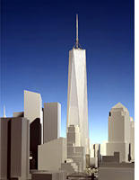
The 77-story Freedom Tower has benefited greatly from its most recent redesign. Gone are the Libeskind signature elements: the off-center spire—a clumsy visual echo of the Statue of Liberty—the trapezoidal plan, the crystalline form. The tower now has a square footprint (set well back from the street), and a graceful, tapering shape. The gimmicky open-air structure at the top of the tower (which was to have housed wind turbines, of all things) is gone, too. What Childs has produced instead is a simple obelisk, an appropriate shape for a building that is, at least in part, a memorial.
Technorati Tags: Freedom Tower, Architecture, World Trade Center, Slate
 Slate has an article on the design for the new freedom tower.
No comments:
Post a Comment